


A good-looking ad does not automatically make sales. Plenty of brands pay for polished visuals, collect a handful of likes, and sell nothing. The colors and fonts are rarely the real problem. High-converting Facebook ads work because the message, visual, offer, audience and call to action all point in one direction. Strong social media ad design is less about decoration and more about one clear promise to the right person. That rule applies to all social media design meant to earn money, not just compliments. Below, you will learn how to design Facebook and Instagram ads step by step. You’ll also get current ad sizes, safe zone tips and the mistakes that quietly drain ad budgets.
Quick answer: Start with a single campaign goal and an offer shaped for a specific audience. Stop the scroll with a strong visual hook, a mobile-friendly layout and short, readable copy. Include one obvious CTA, and build each creative to fit its placement. After launch, test variations and judge them by leads, purchases or other conversions that matter to your business.
Keep this short list of Facebook ad design best practices open while you work:
- Set one conversion goal per ad.
- Know your buyer’s pain points and objections.
- Open with a visual hook that stops the thumb.
- Build a clean layout for small screens first.
- Write a copy around a single benefit.
- Add one CTA that matches the landing page.
- Rework the creative for each placement.
- Preview, test and improve using real conversion data.
How to Design Facebook & Instagram Ads That Convert: 8 Steps
Each step below builds on the one before it, so work through them in order.
Step 1: Define One Conversion Goal for Your Ad
Every ad should have one job. Decide the single action you want people to take before you open a design tool.
Effective social media ads design starts here, because the goal decides what belongs on the canvas. An ad selling a $40 water bottle looks nothing like an ad booking a $2,000 remodel consultation. The first needs the product front and center. The second needs trust, faces and proof.
Match your goal to the campaign objective in Meta Ads Manager too. Choose Sales for purchases and Leads for sign-ups or quote requests. Meta then shows your ad to people most likely to take that action. Lead campaigns need a strong offer, so see our guide to generating high-quality leads.
| Goal | What the design should show | Typical CTA |
|---|---|---|
| Product purchase | Product in use, price or offer | Shop Now |
| Lead or sign-up | The free guide, quote or trial people get | Sign Up or Get Quote |
| Booking | The service, the result, how quick booking is | Book Now |
| Inquiry | Trust signals, reviews, a real person | Send Message |
Your conversion goal shapes the visual, the copy and the button, so set it first and keep it to one.
Step 2: Understand Your Target Audience and Their Pain Points
People act on an ad when they feel it was made for them. That only happens when you know what they want, what worries them and how they talk.
Good social media marketing design pulls from four things:
- Motivation: The real reason someone buys. A new parent shopping for a car seat cares about safety more than style.
- Objections: What stops them from buying. Price, trust, setup time and doubts about fit are the usual ones.
- Language: The words your buyers actually use. Read your reviews, DMs and sales calls, then borrow their phrases.
- Visual context: Scenes they recognize from daily life. A Dallas homeowner relates to a sweaty living room in August, not a generic stock photo.
One easy research method is reading 20 to 30 customer reviews, including your competitors’ one-star ones. Patterns show up fast, and they often turn into your best headlines. For wider context, read about social media marketing trends in 2026.
Step 3: Create a Scroll-Stopping Visual Hook
Your visual hook exists to stop the thumb. People scroll quickly, so the first frame must earn attention within a second or two.
Scroll-stopping Facebook ad creatives usually rely on one of these hooks:
- Product in use: Show the result, not the box. A blender crushing ice beats a blender sitting on a counter.
- Surprising comparisons: Put two things side by side that make people look twice.
- Motion: A small movement in the first second catches the eye in a still feed.
- Direct questions: On-screen text that names a pain point makes viewers answer it in their head.
- Emotional relevance: Relief, pride or a small laugh sticks better than a feature list.
- Contrast: Bold colors against a calm background, or a bright product on a dark surface.
Here are three Instagram ad examples of hooks you can adapt:
- Coffee subscription: A $6 café latte sits next to a home brew that costs under a dollar. On-screen text reads “Same taste. Way less.”
- Rugged phone case: The video opens with a phone hitting concrete. A hand picks it up without a scratch.
- Dallas cleaning service: A split screen shows a greasy oven before and after, with “3 hours of scrubbing vs. 40 minutes with us.”
Step 4: Design a Clean, Mobile-First Layout
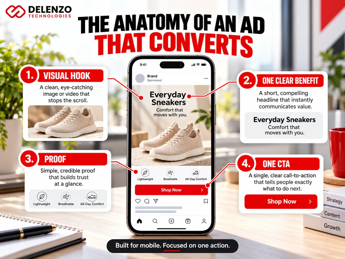
Design for a phone screen first, because that is where most people will see your ad. Layouts that work at thumb size work everywhere.
Good Facebook ad design follows a clear order. Viewers should notice the visual first, the headline second and the CTA third. Solid social media graphic design gets that order right with a few simple choices:
- Visual hierarchy: Make one element the biggest and brightest. Everything else supports it.
- Readable typography: Use one or two bold, plain fonts. Skip thin script fonts that blur on small screens.
- Color contrast: Pair dark text with light backgrounds, or the reverse. Aim for at least a 4.5:1 contrast ratio, the WCAG standard for normal text.
- Whitespace: Leave breathing room around the product and headline. Crowded ads feel cheap and confusing.
- Branding: Keep your logo small and in a corner, and use your brand colors consistently.
- Key info in view: Put the offer and product near the center, away from edges that may get cropped.
One of the simplest Instagram ad design best practices is the arm’s-length test. Hold your phone at arm’s length and look at the ad for two seconds. When you cannot read the headline or tell what you sell, simplify.
Step 5: Write Clear Ad Copy Around One Benefit
Pick one benefit and build every line of copy around it. Trying to say five things at once usually means people remember none of them.
Persuasive ad copy has four parts:
- Headline: The short line that grabs attention, placed on the image or just below it.
- Value proposition: What the buyer gets and why it beats other options.
- Benefit-led message: The outcome, explained in plain words. “Sleep through the night” beats “memory foam technology.”
- Supporting proof: Reviews, star ratings, numbers or results that make the claim believable.
Lead with the most important point in the first line of primary text. Meta often hides longer text behind a “See more” link, so the opening must work alone.
Compare these two Facebook ad copy examples for a made-up skincare brand:
| Aspect | Generic version | Specific version |
|---|---|---|
| Headline | Premium Skincare Products | Calm Dry, Flaky Skin in 14 Days |
| Benefit | Luxury formula | Fewer dry patches by week two |
| Proof | None | 4.7 stars from 1,900 verified buyers |
| CTA | Learn More | Shop Now |
The specific version wins because it names a problem, a timeframe and proof. Only use claims you can back up, though. Meta reviews ads for misleading results claims, and unsupported promises can get an ad rejected.
A couple of other examples show the same idea in different industries:
- Local plumber: “Same-day water heater repair across Dallas. Upfront pricing before we start any work.”
- Fitness coach: “A 20-minute home workout plan built for busy parents. No gym needed.”
Step 6: Add One Clear Call to Action
Ask for one next step only. A single CTA removes guesswork, while two or three choices often lead to no click at all.
Common options include:
- Shop Now for product sales
- Book a Consultation for service businesses
- Get a Quote for contractors, agencies and B2B offers
- Sign Up for newsletters, trials and webinars
Meta’s button menu uses shorter labels like Book Now and Get Quote. Put the longer wording in your image text.
The action must match both the offer and the page people land on. A “Book a Consultation” offer should open a booking calendar, not your homepage. A gap between promise and page is one of the fastest ways to waste ad spend.
Adding CTA text inside the image can help too. Meta adds its own button, but a tiny on-image line like “Tap to shop” reinforces it.
Step 7: Adapt the Creative for Facebook and Instagram Placements
The same ad should not look identical everywhere. Feed, Stories, Reels and Carousel placements each show your creativity in a different shape and setting.
Smart social media ads graphic design treats each placement as its own canvas:
- Feed: People scroll past while reading. A 4:5 vertical image with a readable headline works well.
- Stories: Full screen and quick. Bold visuals and very little text perform best.
- Reels: Entertainment-first video. Plan for sound, but add captions for people watching muted. Creator-style ads blend in better.
- Carousel: Several cards in one ad. Great for showing a product range, steps or a before-and-after story.
Meta can crop one file automatically, but it often cuts off text or products. Building separate versions keeps you in control. You will find exact sizes in the format table below. Each placement should also fit your wider social media marketing plan.
Step 8: Preview, Launch and Improve Your Ad Creative

Preview every ad before launch, then test and improve it based on real results. Your first version is a starting point, not the final answer.
Begin with the placement previews inside Ads Manager. Check each one for cropped text, covered logos and blurry images.
After that, run Meta ads creative testing with a written plan. Use Meta’s built-in A/B test tool and change only one thing per test:
- The hook or first frame
- The headline
- A still image versus a short video
- The CTA wording
Give each test enough time to collect usable data. Meta’s help documentation says an ad set needs about 50 optimization events in seven days to exit learning. Judging an ad after one day or a handful of clicks usually leads to wrong calls.
Many high-converting Instagram ads come out of this cycle. Keep the winner, drop the loser, and test a fresh idea against it. Watch frequency as well, since results tend to slip once the same people see an ad too often.
Testing and reporting take hours each week. A social media ad design service can handle both creative and testing for you. Delenzo Technologies, a creative agency in Dallas, offers paid advertising services for businesses across the USA.
Best Facebook and Instagram Ad Sizes and Formats in 2026
Use 4:5 for feed ads, 9:16 for Stories and Reels, and 1:1 for carousel cards. Designing each version on purpose beats relying on automatic cropping.
These are the Facebook and Instagram ad sizes most advertisers work with right now:
| Placement | Ratio | Recommended size (px) | Notes |
|---|---|---|---|
| Facebook Feed | 4:5 | 1080 x 1350 or 1440 x 1800 | Fills more mobile screen than square |
| Instagram Feed | 4:5 | 1080 x 1350 or 1440 x 1800 | Meta’s preferred feed shape |
| Square feed / carousel | 1:1 | 1080 x 1080 | Safe fallback for every card |
| Facebook Stories / Reels | 9:16 | 1080 x 1920 or 1440 x 2560 | Full-screen vertical |
| Instagram Stories / Reels | 9:16 | 1080 x 1920 or 1440 x 2560 | Keep key elements in safe zones |
In short, plan for three shapes: 4:5 for feed, 1:1 for carousel and 9:16 for Stories and Reels.
Files at 1080 pixels wide still work fine. Several current guides, citing Meta’s Ads Guide, list 1440-pixel exports for sharper results on high-density screens. Specs change from time to time, so confirm final sizes in Meta Ads Manager before you publish. For Instagram ad design in particular, vertical 9:16 creative matters more each year as Reels keeps growing.
Facebook and Instagram Feed Ad Design Best Practices
For most feed ads, choose 4:5 over 1:1. The taller shape fills more of a phone screen, so your product gets more space.
Square images still have a place. They suit carousel cards and ads you want to run across many placements with one file.
Sound graphic design for social media in the feed comes down to a few habits:
- Make the product large and place it in the middle of the frame.
- Limit on-image text to the headline and offer.
- Put the headline near the top, where eyes land first.
- Use actual photos of your product over generic stock images.
Instagram Stories and Reels Ad Design Best Practices
Stories and Reels ads should fill the full 9:16 screen and feel like regular content. Polished, TV-style commercials tend to get skipped fast.
Effective Instagram ad creatives for these placements share a few traits:
- Full-screen visuals: No black bars or tiny centered images.
- Subtitles: Many people watch with the sound off, so captions carry the message.
- Native style: Handheld video, real people and quick cuts feel at home between organic posts.
- 9:16 safe zones: Keep text, logos and buttons away from the top and bottom edges.
A basic selfie-style video of a founder explaining a product can outperform a polished studio shoot here. It usually costs far less to make. Hooks and pacing are covered in our high-converting marketing video guide.
How to Keep Text, Logos and CTAs Inside Safe Zones
Keep important elements away from the screen edges, where Facebook and Instagram place their own buttons and captions. Anything in those areas may get covered.
Widely used guidance for a 1080 x 1920 vertical ad looks like this:
- Top: Leave about 14% (roughly 270 pixels) clear for the profile name and progress bar.
- Bottom on Stories: Leave about 20% (roughly 380 pixels) clear for the reply bar and link.
- Bottom on Reels: Leave about 35% (roughly 670 pixels) clear for captions, likes and the CTA button.
- Sides: Leave about 6% (roughly 65 pixels) on each side.
Designing to the stricter Reels margins keeps one file safe in both placements.
Picture a Reels ad with “50% Off Ends Sunday” placed along the bottom of the frame. Once it goes live, the caption and the Shop Now button sit right on top of that line. Viewers see the product but miss the offer completely.
The fix takes a minute. Move the offer toward the center and turn on safe zone guides in your design tool. Ads Manager previews will show the overlays before you spend a single dollar.
Common Facebook and Instagram Ad Design Mistakes to Avoid
Many failing ads break one of a few basic rules. Avoid these eight mistakes and your ads will already look better than many in the feed.
- Too much text in the image: Long paragraphs on a graphic are hard to read on a phone. Move details into the caption.
- Weak visual hierarchy: When everything is the same size, nothing stands out. Viewers do not know where to look first.
- Multiple competing messages: A sale, a new product and a giveaway in one ad confuse people. Save each idea for its own ad.
- Low-quality or irrelevant visuals: Blurry photos and random stock images hurt trust instantly.
- Poor mobile formatting: Tiny fonts and edge-placed text get lost on small screens.
- Missing or unclear CTA: People who do not know what to do next simply keep scrolling.
- No difference between Feed and Reels assets: A cropped feed image looks out of place in a full-screen Reel.
- Ad promise that does not match the landing page: Promise 30% off, then show full prices. Visitors leave, and they trust your next ad less.
Should You Design Social Media Ads Yourself or Hire a Professional?
Design ads yourself if you have time, a small budget and simple products. Hire a professional when ad spend grows, results stall or you need many versions for testing.
DIY is a fair starting point. Social media design templates in Canva or Adobe Express give you correct sizes and decent layouts in minutes. Popular social media design tools include:
- Canva: Easy drag-and-drop templates, with a Pro plan priced at roughly $15 a month.
- Adobe Express: Quick resizing and brand kits for small teams.
- Figma: Better for layered designs and reusable ad systems.
- CapCut: Beginner-friendly video editing with auto-captions for Reels and Stories.
Templates have limits, though. Thousands of other brands use the same layouts, so your ads can start to look familiar. AI tools hit similar walls, as our look at whether AI design tools can replace a designer explains.
A skilled social media designer brings strategy, not just visuals. They know which hooks to test, how to build sets of variations and how to read results.
| Aspect | Do it yourself | Hire a professional |
|---|---|---|
| Cost | Low, mostly tool fees | Higher upfront, often a monthly retainer |
| Speed | Slower while you learn | Faster, with ready systems |
| Testing volume | A few versions | Many variations per month |
| Best for | New brands with small budgets | Growing brands scaling ad spend |
Start DIY to learn what works, then bring in experts once ads become a core sales channel. Typical rates are listed in our graphic design pricing guide.
Professional social media design services make the most sense when every week of weak ads costs real money. Delenzo Technologies offers graphic design services and ad creative design services from Dallas. Brands across the USA can work with us on flexible contracts.
Final Thoughts
Ads that convert come from clear thinking first and nice visuals second. Commit to one goal, know your buyer, open with a strong hook and build every layout for mobile. Write around one benefit, use one CTA and size each creative for its placement. From there, keep testing and keep learning.
A huge budget is not required to get this right. Focus and patience with testing matter far more.
Delenzo Technologies can take the design work off your plate. Our Dallas team provides social media graphic design services and marketing graphic design services for businesses across the USA. We build ad creatives around your goals and review results with you every week. Contact us to plan your next campaign.
Frequently Asked Questions About Facebook and Instagram Ad Design
What makes a Facebook ad convert?
A Facebook ad converts when a relevant offer meets the right audience. Pair a scroll-stopping visual with benefit-led copy, a single CTA, and a landing page that matches the promise.
What type of Instagram ad creative works best?
Short vertical videos in Reels and Stories often perform best on Instagram. Use 9:16 framing, a hook in the first second, captions for silent viewers, and a native, creator-style look.
What size should Facebook and Instagram ads be?
Use 1080 x 1350 pixels (4:5) for feed ads and 1080 x 1920 pixels (9:16) for Stories and Reels. Carousel cards work best at 1080 x 1080 pixels (1:1).
How much text should I put on a Facebook ad image?
Limit image text to a short headline and offer. Meta dropped its old 20% text rule, but it still notes that lower-text images tend to perform better.
